I was recently super inspired by an Instagram post from streetartglobe that showcased an intriguing animation:
12 steel balls each travel along a straight line in a sine wave motion. This gives the illusion that they are forming a rotating circle. But they are actually travelling in a straight line 🤯
This mind blowing visual effect made me wonder if I could recreate it using pure CSS. TL;DR here’s the result in my playground area. You can experiment with the animation and debug it using some additional controls.
In this post, I’ll explore the CSS animation technique that creates the illusion of 12 balls spinning in a circular path. This effect is achieved through a clever use of CSS variables and keyframe animations, resulting in a visually captivating pattern. We’ll also touch on how this relates to the mathematical concept of the irrationality of π (Pi).
Understanding the Illusion
The animation gives the impression that 12 balls are rotating around a central point in a circle. However, the reality is that each ball is simply moving back and forth along the diameter of a larger circle. This is accomplished by manipulating CSS transforms and leveraging CSS variables to control the animation.
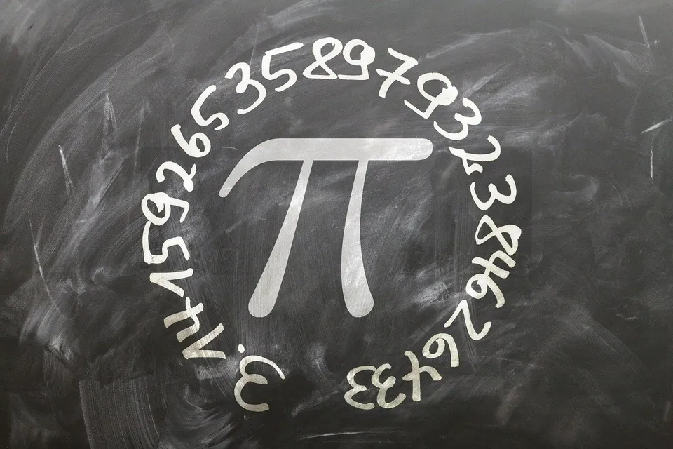
Connection to the Irrationality of π
The irrationality of π refers to the fact that π is a non-repeating, non-terminating decimal. This property of π is what makes it so fascinating and complex. In our animation, we mimic this complexity by creating a pattern that appears to be circular and continuous, yet is actually composed of linear, back-and-forth movements.
Just as π cannot be precisely expressed as a simple fraction, the animation cannot be easily described as a simple circular motion. Instead, it relies on the interplay of multiple linear motions to create the illusion of a circle. This mirrors the way π’s irrational nature is composed of an infinite series of non-repeating digits.
Key CSS Variables
The CSS code uses several root variables to define the properties of the animation. Let’s break down the key variables and their roles:
--ball: Defines the size of each ball.--rotation: Sets the initial rotation angle for each ball.--base-delay: Determines the base delay for the animation, creating a staggered effect.--animation-duration: Specifies the duration of the animation cycle.--animation-function: Defines the timing function for the animation, controlling the speed curve.--circle: Represents the diameter of the larger circle.--circle-radius: Calculates the radius of the larger circle.--circle-radius-: Calculates the negative radius, used for the initial position of the balls.
Keyframes Animation
The @keyframes rule is central to creating the animation. It defines the transformation of each ball from one end of the diameter to the other:
@keyframes moveball {
  0% {
    transform: rotate(var(--rotation)) translate3d(var(--circle-radius-), 0, 0);
  }
  100% {
    transform: rotate(var(--rotation)) translate3d(var(--circle-radius), 0, 0);
  }
}
How It Works
-
Initial Positioning: Each ball starts at a position defined by
translate3d(var(--circle-radius-), 0, 0), which places it at one end of the diameter. -
Rotation: The
transformproperty rotates the ball by the angle specified in--rotation. -
Translation: The
transformproperty then moves each ball along the x-axis totranslate3d(var(--circle-radius), 0, 0), from one side of the circle to the opposite end, on its diameter. -
Staggered Effect: The
animation-delayis calculated for each ball using--base-delay, creating a staggered effect that makes the balls appear to move in a circular path.
Animation Delays and Colors
The staggered effect is further enhanced by assigning different animation delays to each ball. This is done using nth-child selectors:
.ball:nth-child(1) {
  animation-delay: calc(var(--base-delay) * 0);
  background-color: darkorange;
}
.ball:nth-child(2) {
  animation-delay: calc(var(--base-delay) * -1);
  background-color: palegreen;
}
/* More balls with different delays and colors */
Debugging and Customization
The code includes a debug menu that allows you to experiment with different settings, such as showing labels, displaying only one ball, or pausing the animation. Use this to reveal the labels for each ball, which show how it is rotated and translated along the diameter. From there you can also just view one ball, which makes it easier to see that each ball is actually just moving back and forth along the diameter. You can also pause the animation to inspect the positions of the balls at any point in time.
Playground
This advanced CSS animation technique demonstrates how CSS variables and keyframe animations can be used to create complex visual effects. By understanding the interplay between these elements, you can create your own unique animations and enhance the visual appeal of your web projects.
The connection to the irrationality of π lies in the complexity and non-repeating nature of the animation, which mirrors the mathematical properties of π. Feel free to experiment with the code and customize the animation to suit your needs!
Visit the playground to try it out yourself!
Going in circles
Thanks for reading this far, so here’s a little joke to wrap things up:
Why did π (Pi) refuse to play cards with the mathematicians?
Because every time they tried to round him up, he’d just keep going in circles!
🥧