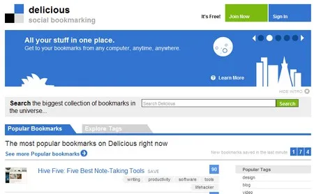
Looks like the long awaited web 2.0izing of the del.icio.us website is finally here. Very sleek and sexy is my first impression.

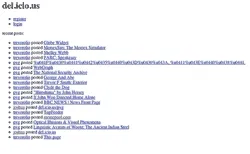
Take a look at some of the older user interfaces to get a sense for how del.icio.us has evolved until now. Aside from the new look there are new features as well. The delicious dev team has supposedly completely rewritten the code base, to allow for a more scalable and spry tool.
New features:

Navigation: New simple CSS tabs with onClick drop down menus make is simple to find your tasty bookmarks. The navigation structures seems to borrow from Flickr. Search also comes with a simple drop down option list to find stuff in your bookmarks, network or everyone.
Bookmarks: You have Title view, regular view and Full View options here. View your popular bookmarks to filter the good stuff and filter down more by choosing fresh only.
Sidebar: is updated to show a relative set of tags related to your left content pane.
Action Box: This light blue box in the sidebar shows the common tasks for the given page.
Search URL: This is a reverse search for bookmarks and pulls in the ones with the given URL along with tags used for that URL by each user, broken down in chronological order. You can also view the notes added by each user to the given URL.
Settings: The settings page is laid out with all the actions listed on one page, similar to a sitemap.
Forums: There is a support forum that looks more like a categorized list of links than a forum. I like the non-cluttered design. Reminds me of Drupal.
As in the past their API is still available for developer consumption.